
MoTiV project partners are out in force, running data collection campaigns with the Woorti app to gather user input on the perceived value of travel time. Spread across 10 different countries and in 11 different languages, the Woorti data collection campaigns were launched in May 2019. Given that we are a little over half-way through the time allocated for these campaigns, which conclude in October, we thought it would be a good idea to let the public in on some of the insights we’ve gained so far.
However, before going any further, please note that the data in this article represents a preliminary analysis only, based on data collected from May 1st until July 30th. Any data presented should betaken with a pinch of salt, and not understood as formal project results.
First, let’s start with modal share:
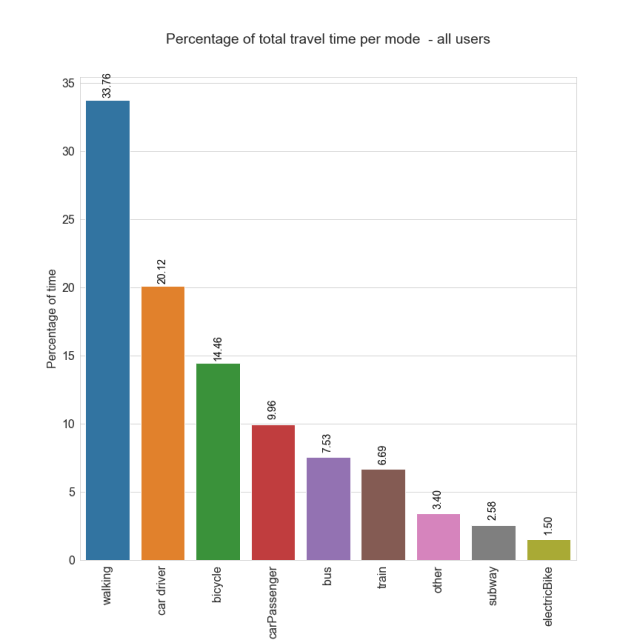
In the above graph you can see the amount of time Woorti users reported to us that they spent using each mode of transport. Walking is the ‘stand-out’ winner, second only to the aggregate time spent driving a car and being a car passenger. Other modes of transport were reported as being used far less, with the total of all public transport modes representing just 16.8% of time spent, closely followed by bicycle and e-bike modes, which together represented 15.96% of transport time.
Moving on to travel time ‘worthwhileness’:
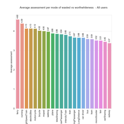
Users of the Woorti app are asked to give an overall rating (out of 5) whenever they report a trip. Users were generally positive about all modes of transport, the lowest score being for travel by subway which received an average score of 3.37/5. Interestingly, this differs significantly from electric bike users, which placed fourth in our index, scoring 4.13/5. In a similar fashion, carsharing placed 21st, with a score of 3.45/5, lower than car sharing as a passenger, which scored 3.67/5.
Active modes of transport also scored well with running topping the index, whilst travel by electric bike, walking, bike sharing, and the bicycle all scored in either the top half or top quarter of the preliminary results. Notably, both car driver and car passenger modes of transport scored only in the middle of the pack for worthwhileness, which is very relevant considering that these two modes of transport represent (joint with walking) the highest percentage of the time we spend traveling.
Lastly, for those environmentally inclined, we can look at the total amount of C02 created by each mode of transport Woorti users chose:

Here we can see that of the reported trips, car use generated the most amount of CO2 by far, representing (once the car and car passenger categories are added together) 60.50% of all CO2 emissions in the study. However, it shouldn’t be forgotten that these categories make up 44.90% of the total distance traveled by Woorti users, while other modes of travel, such as the plane, made up a far smaller proportion. Indeed, air travel represents just 0.25% of all travel time and 6.95% of the total distance traveled yet accounts for 24.19% of CO2 emissions. The only active travel mode to produce CO2, the electric bicycle, produced just 19kg of CO2 emissions, 0.094% of the total, yet represented 1.50 % of people’s time traveling and 1.31% of the total distance traveled.
References:
Y. Cornet , J. Bernardino, M. Barradale & G. Lugano (2019). Worthwhile Travel Time: Design Challenges of Capturing the User Experience by Smartphone. Proceedings of the Smart Cities Symposium Prague 2019 (SCSP 2019), 23-24 May 2019, Prague (Czech Republic).
References:
- Cornet , J. Bernardino, M. Barradale & G. Lugano (2019). Worthwhile Travel Time: Design Challenges of Capturing the User Experience by Smartphone. Proceedings of the Smart Cities Symposium Prague 2019 (SCSP 2019), 23-24 May 2019, Prague (Czech Republic).
- Hudák, M. Gogola (2018). The next generation of smartphone travel data collection with implementation of complex stakeholder’s support approach. CMDTUR 2018,4-5 October, Zilina (Slovakia)